
How to Style Art for Warm, Earthy Wall Colors
Jun 22, 2025
Bring natural harmony to your space with golden tones and glowing light
Warm-toned walls, terracotta, clay, beige, even soft cinnamon, have a way of making a room feel grounded and timeless. They echo nature’s palette: sunbaked stone, autumn leaves, candlelight. And when styled thoughtfully, they create the perfect canvas for fine art photography that glows with life and emotion.
If you’ve chosen a warm, earthy color for your space, the right art can do more than decorate, it can transform. In this guide, I’ll walk you through a few simple tips for pairing your wall color with prints that feel like they were meant to be there all along.
1. Let the Light in — Golden Hour Magic
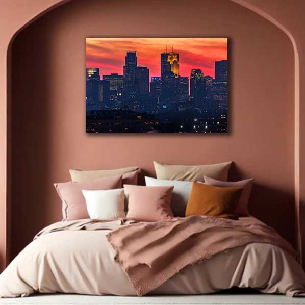
Warm walls love warm light. Art that captures golden hour scenes — that fleeting time just before sunset — naturally radiates against terracotta or beige backgrounds. City skylines bathed in amber light or landscapes glowing with late-day sun will create a soft, tonal harmony that makes your space feel welcoming and alive.
Suggested Print: Minneapolis Sunset 3 — a Minneapolis skyline piece taken just as the sun dips below the horizon, casting long silhouettes of the skyline. It almost hums when paired with a clay-colored wall.
2. Look for Brick, Rust, and Sandstone Tones
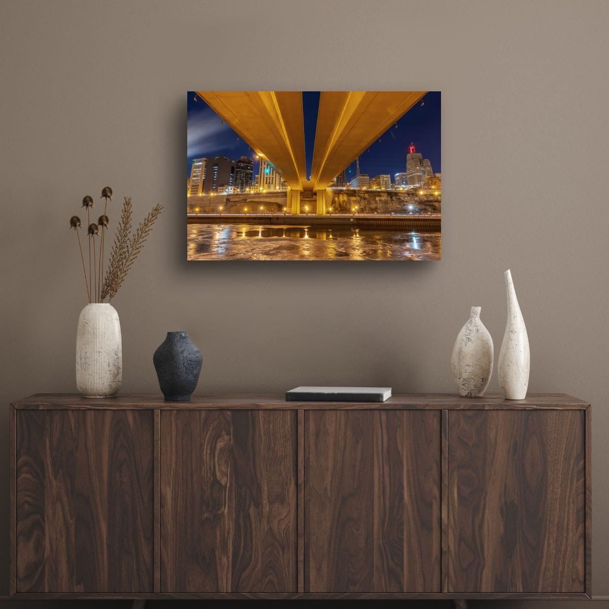
Photographs that include architectural textures, think brick facades, rusted metal, stone steps, or historic rooftops, echo the richness of earthy walls. These elements create a sense of texture and grounding, reinforcing the organic warmth already present in the space.
Suggested Print: Wabasha Saint Paul — featuring the Wabasha Bridge and the sandstone buildings of downtown St. Paul at night, this image layers gold, bronze, and deep brown tones with ease.
3. Balance the Bold with Soft Neutrals
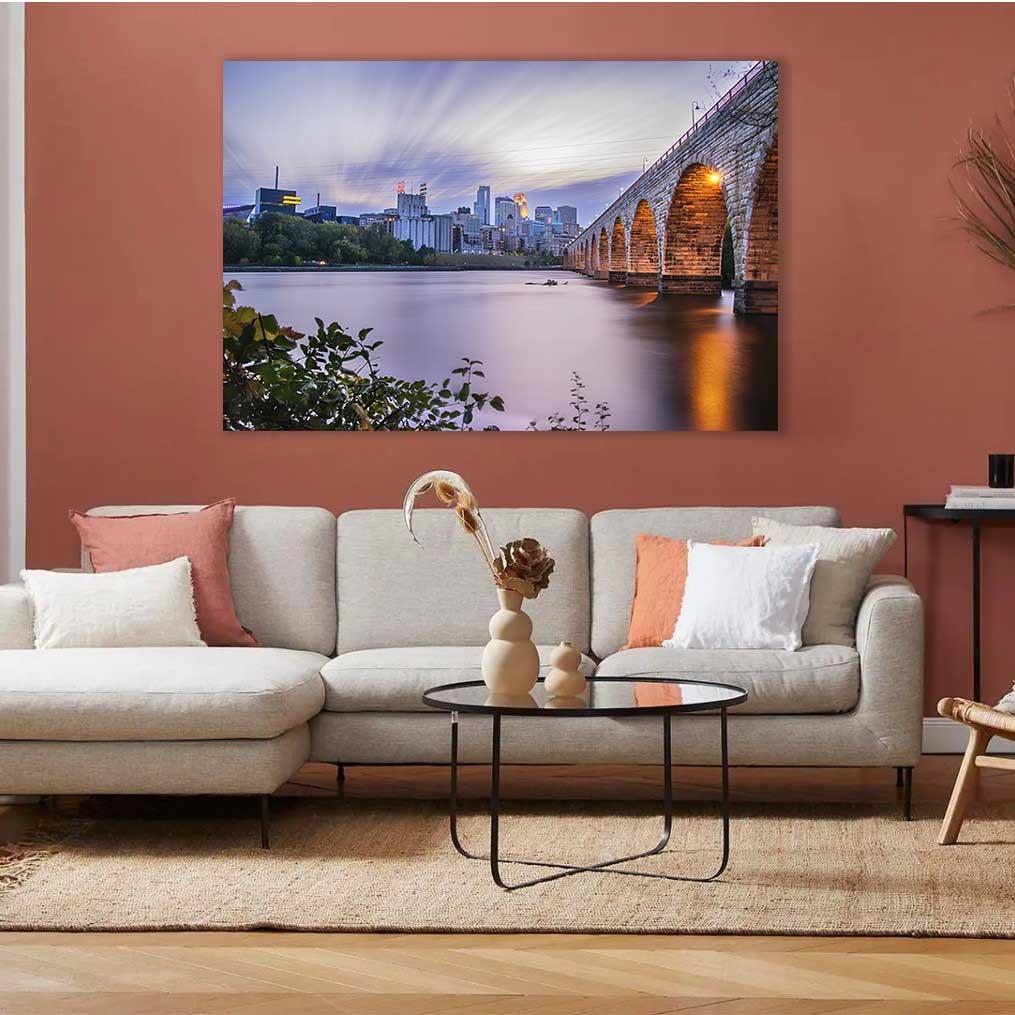
If your wall color leans toward deep terracotta or red clay, balance the boldness with photographic prints that introduce light neutrals, fog, clouds, or open sky. This contrast prevents the room from feeling too heavy while still keeping things cohesive.
Suggested Print: Stone Arch Bridge Skyline — a wide-open view with soft skies and subtle warmth reflecting in the water. Its quiet palette calms the intensity of deeper wall colors without clashing.
4. Use Warm Colors to Anchor Open Spaces
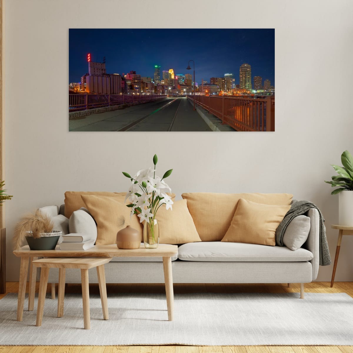
In open-concept homes or larger rooms, warm walls can sometimes feel expansive but undefined. Choosing artwork with strong gold, copper, or burnished orange tones helps visually anchor the space, like a well-placed rug, but for your eyes.
Suggested Print: Minneapolis and the Stone Arch Bridge — a bold cityscape with glowing streetlights and historic brick textures that pull the eye inward. It works especially well on beige or tan walls in living rooms or dining areas.
5. Tell a Story That Matches the Mood
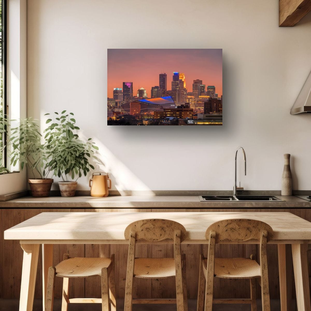
Ultimately, styling art isn’t just about color, it’s about emotion. Warm wall colors create a feeling of nostalgia, comfort, and connection. Choose artwork that shares that same story. Cityscapes that feel like coming home. Twilight moments that feel like memory.
Suggested Print: Twilight Gold — a print filled with golden light washing over the entire city. It doesn’t demand attention; it simply belongs.
Bring the Glow Home
When art and environment speak the same language, your space becomes something more: a place that reflects you, supports you, and inspires you. If you’ve been searching for fine art prints that complement the warmth of your walls, this is the perfect place to start.
Explore my collection of warm-toned cityscape prints, available in canvas, metal, and fine art paper, and bring natural harmony to your home.
Because your walls deserve art that feels as good as it looks.
Color Your World.